Composing Better Photos - Negative Space
My semi blogging break in August, has left me feeling rejuvenated, and ready to start blogging again with aplomb! Ideas that have been milling around in my head for a while have started to come together and once that happens, for good or bad, I'm not one to wait, I just like to get on with things. And that's what today's post is, an idea for a new blog series that I thought I would try. When I asked for feedback on the blog a few months back, one thing that a couple of people asked for, was for me to share my photography styling tips. Now, I most admit, at first, I wasn't sure about doing this, it felt a bit like giving my secrets away. But over the past month I have given it more consideration, and realised actually, everything is open to individual interpretation, and one thing that gives me real pleasure in the workshops I teach, is seeing students learn, and then go on to create beautifully styled images themselves.
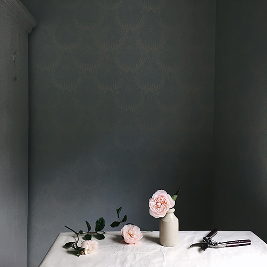
It was easy to decide on my first topic, because for me, this is one of the most important. It can totally change the feel of a photo. Negative space, is the space around the subject of a photo, the empty space in your image. It can be the table on which your props sit, the sky above a building, or the wall behind a person, but whatever it is, it will draw your eye to the subject of your photo, which is why it is so important. Rightly, or wrongly, I tend to use a lot of negative space, but that's just my style, and it doesn't mean that you have to do the same. In fact, I think developing your own style is what will set you apart in this image heavy world of social media that we now occupy.
Along with defining the style of photography, the amount of negative space in your photo, will make a big difference to how your subject looks.
Let's start with the close up:
Now, slightly further out, I have kept the same props for each photo and more or less the same layout, just adjusted them slightly to balance the composition with the space around.
Finally, and not surprisingly my favourite, lots of negative space, and far enough out to show a glimpse of the surroundings, adding a bit of interest to the final image.
Next, the same props, just a slightly different set-up. I'm not keen on this close-up at all:
Further out, again lots of negative space, and interest added with the corner of the table.
Taking the photo further back, also enables the addition of an extra prop without the scene looking too crowded, in this instance the essential styling mug of tea!
Finally, a flat-lay example. Starting with the close up again:
And now with more negative space, I've moved the flowers back a bit, again so the composition is balanced. But I much prefer this, I think being able to see more of the table, and also more of the stems makes the photo. That is just my personal opinion of course, what do you think?
So, next time you take a photo, try taking a few steps back, and then maybe a few more, you never know you might like the result.
If you fancy learning more styling and composition tips to improve your photos for visual media, I have a few workshops coming up in Brighton over the coming months;
Sunday 20 September - Basic Styling, Composition & Photograpy for Visual Media
Monday 21 September - Basic Styling, Composition & Photography for Visual Media
Sunday 11 October - Visual Media Styling & Photography for Florists
Monday 12 October - Developing Your Visual Media Style
Sunday 1 November - Basic Styling, Composition & Photography for Visual Media
Monday 2 November - Basic Styling, Composition & Photography for Visual Media
You can read more about these workshops here, or by emailing me. Or if you would like to be notified when further dates are available, please enter your email address in the subscription box in the sidebar to the right, or drop me an email to hello@aquietstyle.co.uk.
If you would like to see anything else included, or have any feedback about this new series I would love to hear from you.
Emma x


